- AI Fire
- Posts
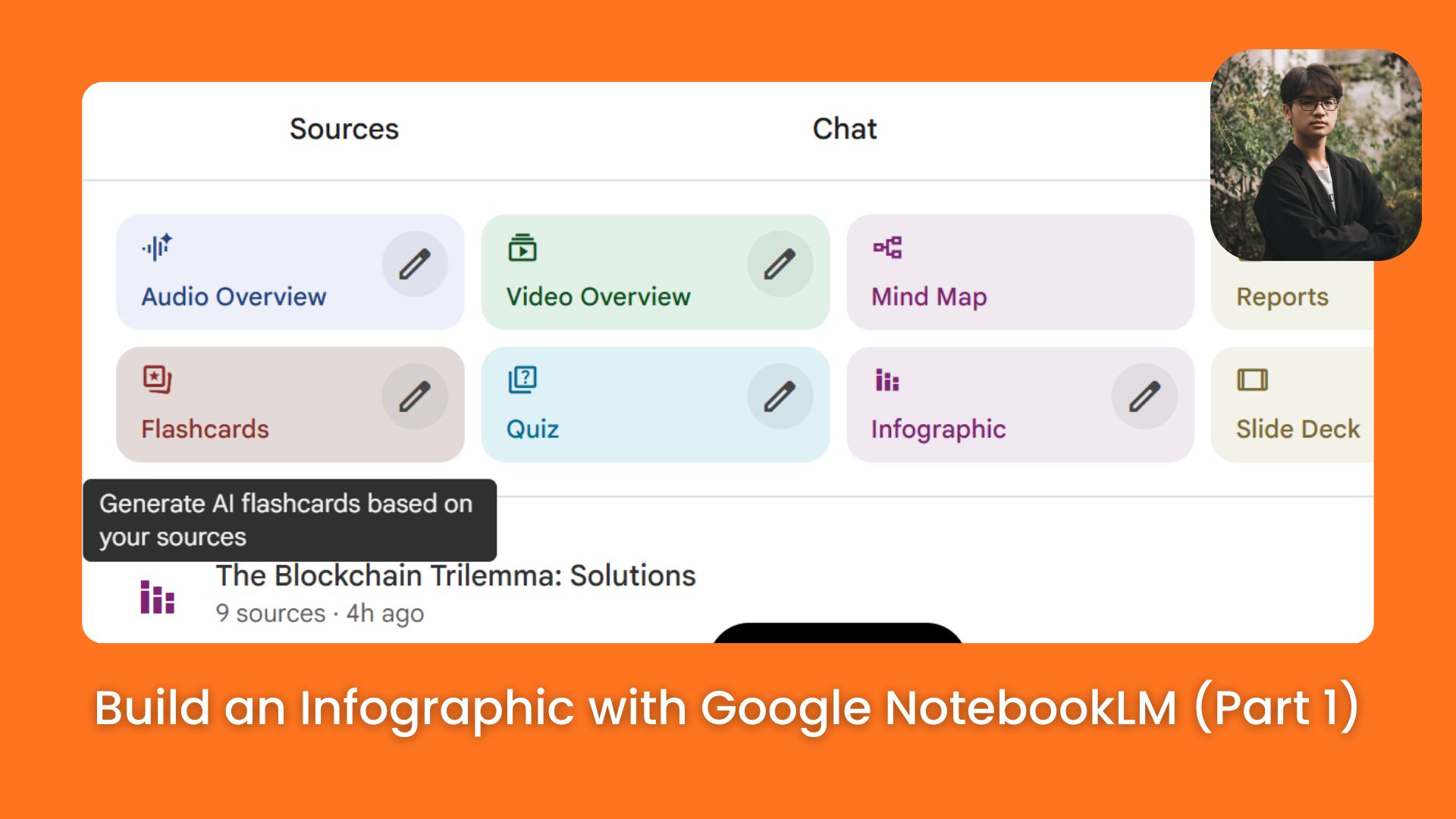
- 📊 How To Build A Media Business Without Hiring A Designer (Part 1)
📊 How To Build A Media Business Without Hiring A Designer (Part 1)
Stop paying $500 for graphics. This guide (Part 1) shows how to use Google NotebookLM to auto-generate professional infographics for your media business in seconds
Max Anh
December 12, 2025
TL;DR BOX
Google’s NotebookLM can now turn your own source data into professional infographics in under a minute. It directly attacks the biggest problem in a media business: visuals are expensive and slow to produce. And it does this while staying loyal to your source, not making things up.
Traditional design is slow and expensive. NotebookLM structures your text (research, blog posts, notes) into ready-to-publish layouts for social and slides. That means you can finally produce volume without destroying your accuracy and that’s what really matters when you’re trying to scale a media business.
Key points
Stat: NotebookLM currently enforces a limit of approximately 10 generated infographics per day per account.
Mistake: Using generic prompts; specific instructions about high contrast and hooks are required for professional results.
Action: Research topics in ChatGPT first, then paste the structured output into NotebookLM for visualization.
Critical insight
NotebookLM distinguishes itself by visualizing only the user's provided data, preventing the hallucinations common in other generative design tools.
🚀 What’s holding you back from launching your app idea? |
Table of Contents
I. Introduction: The $500 Problem for Your Media Business
Most people see infographics as just nice pictures. But in reality, infographics are one of the best content types for driving traffic, earning backlinks and growing an online media business.
The problem has always been production costs:
Designers are expensive (around $300-800 per good graphic).
DIY tools take hours (like Canva requires design skills and 2-4 hours per infographic for quality output).
Now imagine needing 30 of them in a month. So most creators can’t make enough infographics at the volume needed to test and scale.
Google’s NotebookLM just removed that limit.
Its new Infographics Generator creates polished, publication-ready visuals in under a minute, using your sources, not generic AI guesses.
In this first part, I’ll show you exactly how I’d use NotebookLM to turn one tool into a content factory for your media business.
II. Why This Matters More Than Other AI Tools
Most AI design tools generate generic summaries from training data. NotebookLM only works with the information you give it, ensuring accuracy. This makes your infographics feel original, specific and aligned with the unique value proposition of your media business.
Key takeaways
Typical AI tools create generic, surface-level visuals.
NotebookLM visualizes only your supplied content.
This protects your ideas from blending into common AI output.
It becomes a tool for unique insights, not decoration.
When you control the source material, you control the insight. And in a media business, insight is what builds authority.
You might be thinking: “We already have AI design tools. Canva has AI, Midjourney makes images. So what’s actually different about NotebookLM?”
The main difference is source accuracy.
When you ask ChatGPT or Canva to "make an infographic about personal finance", it searches its training data and produces a generic summary. The insights are obvious. The value is minimal.
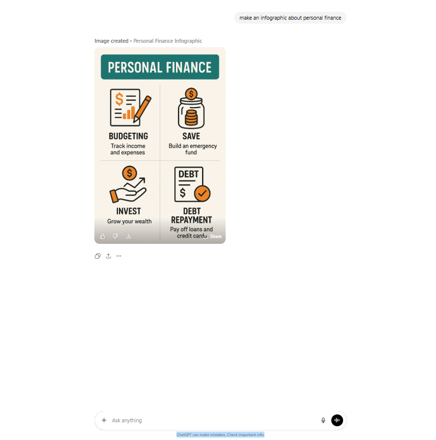
ChatGPT’s result
NotebookLM works differently. It only uses the information you clearly provide. You give it a specific data set (your research, your insights, your proprietary information) and it visualizes that exact content.
This means:
You own the insight: Your infographics reflect your unique perspective, not Wikipedia summaries.
Differentiation: You visualize specific data and processes competitors can't replicate.
Defensibility: Your content becomes intellectual property rather than common, low-quality AI work.
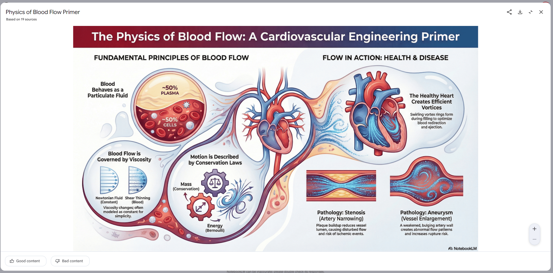
NotebookLM’s output
Learn How to Make AI Work For You!
Transform your AI skills with the AI Fire Academy Premium Plan - FREE for 14 days! Gain instant access to 500+ AI workflows, advanced tutorials, exclusive case studies and unbeatable discounts. No risks, cancel anytime.
III. What Are the Two Features That Change Content Production?
NotebookLM includes an Infographics Generator and a Slideshow Generator. Together, they turn text into polished designs or full presentations in minutes. This shifts your work from dragging boxes around in a design tool to just giving clear instructions. That’s the real unlock if you want to scale.
Key takeaways
Infographics Generator builds ready-to-publish layouts.
Slideshow Generator drafts full decks with structure and charts.
Both reduce hours of design work to minutes.
Agencies can now deliver high-volume assets with minimal overhead.
Speed matters but the deeper win is consistent design output without hiring design talent
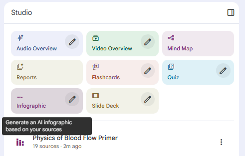
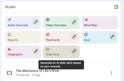
1. Infographics Generator (The Automatic Visual Creator)
The Infographics Generator takes text input and automatically structures it into professionally designed visual layouts.
Input: Research notes, blog posts, statistics, process descriptions.
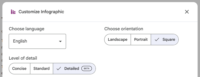
Configuration: You specify the format (Portrait for TikTok, Landscape for YouTube, Square for Instagram), detail level and creative direction.
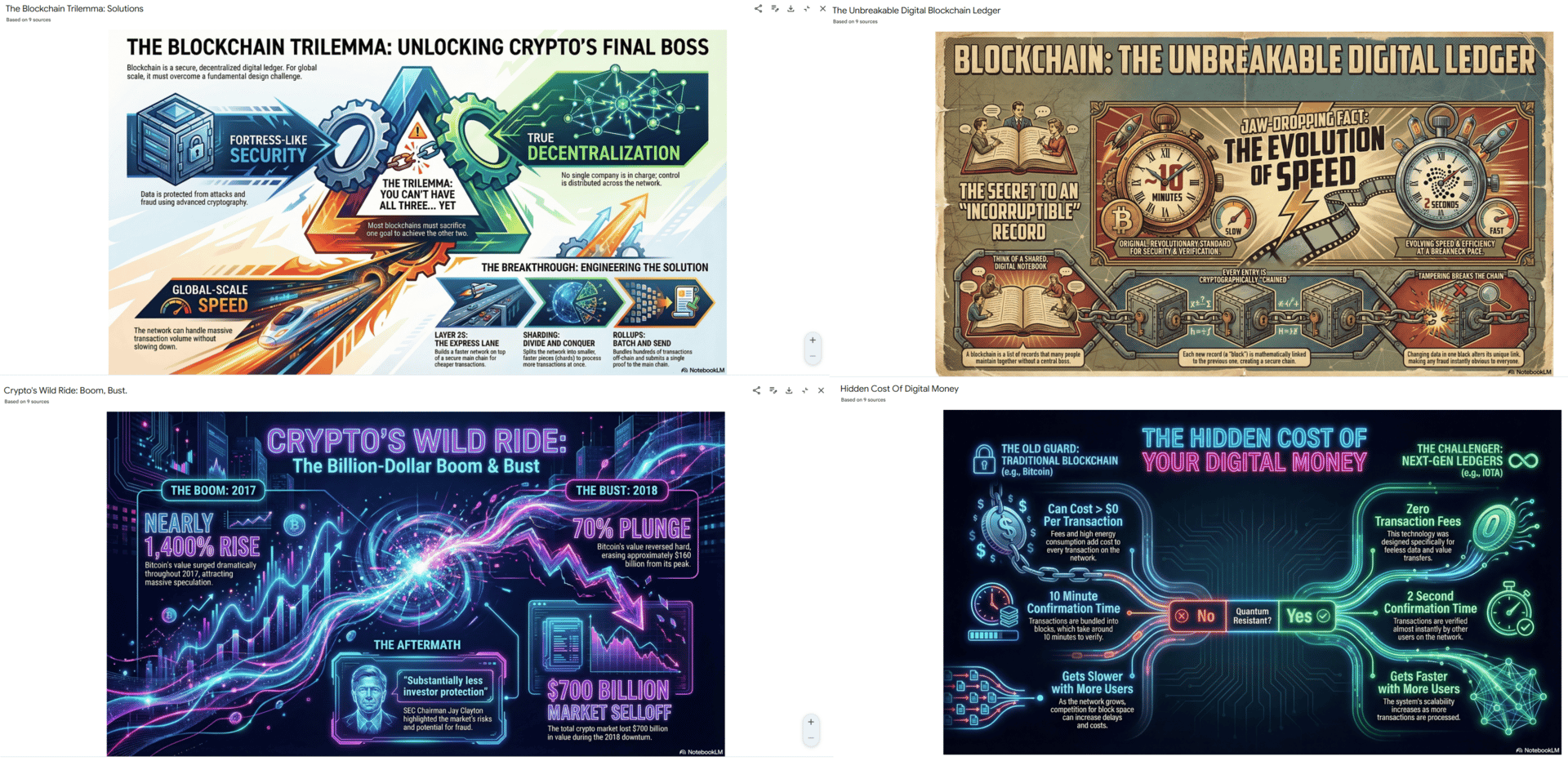
The Quality: From what I’ve seen so far, these aren’t amateur-looking. The examples (domain valuation breakdowns, economic charts, process workflows) look good enough to sit in real articles and decks next to human-designed work.
2. Slideshow Generator (The Presentation Builder)
This creates complete slide deck presentations from your content. It structures information logically, creates visual hierarchy and adds appropriate charts.
The Economic Advantage: What traditionally took 3-5 hours per deck now takes 5-10 minutes. For agencies or consultants building a media business, this is transformative labor savings.
IV. The Production Workflow That Generates Volume
To build a real media business, you need a content factory, not random one-off posts. Here’s the workflow I’d use to turn NotebookLM into that factory.
Step 1: Content Source Preparation
You need input content. I recommend three approaches:
Approach A: Use Existing Content. Paste the URL of your blog post. NotebookLM extracts the core framework and visualizes it.
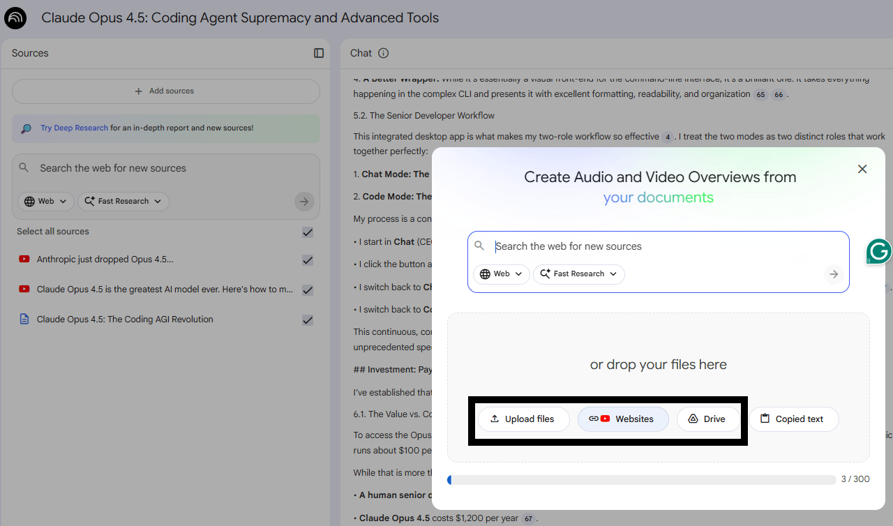
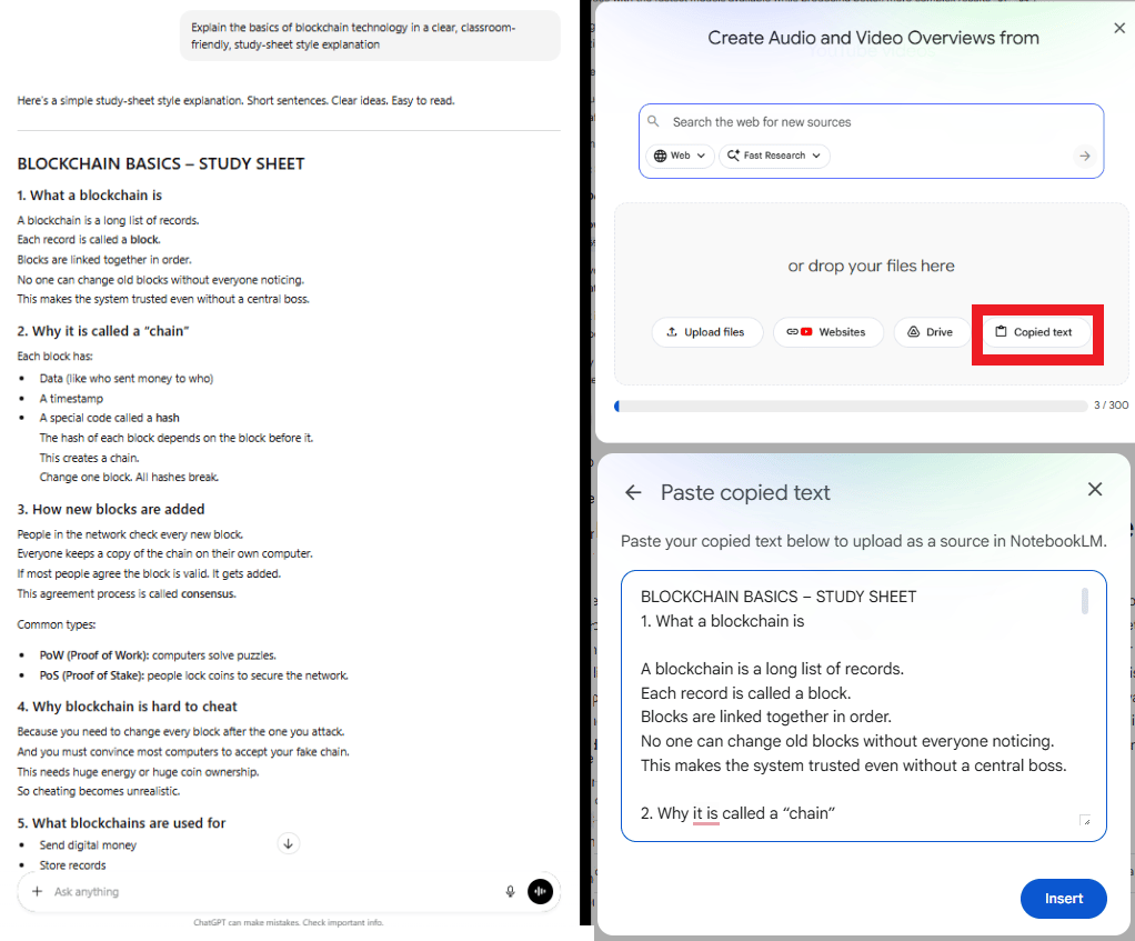
Approach B: Research with ChatGPT First. Use ChatGPT to research a topic (e.g., "Explain the basics of blockchain technology in a clear, classroom-friendly, study-sheet-style explanation"). Copy that output into NotebookLM to visualize it. This combines ChatGPT's research strength with NotebookLM's visual strength.
Approach C: Original Data. Input your proprietary research or customer data. This produces differentiated content that competitors can't replicate.
Step 2: Prompt Engineering for Quality Output
Generic prompts produce generic results. To get professional output for your media business, you need specific instructions.
Basic: "Create an infographic about this topic". (Result: functional but boring).
Advanced:
Create a social media infographic with an engaging hook that stops the scroll, dark background, bright contrasting text, emphasize the shocking statistic, target audience is people worried about financial security.(Result: better than ever, I tried it myself and you know what “garbage in, garbage out” is so true?)
Key Insight: You aren't just asking for "an infographic". You’re telling NotebookLM the format, the audience, the psychology the style you want.
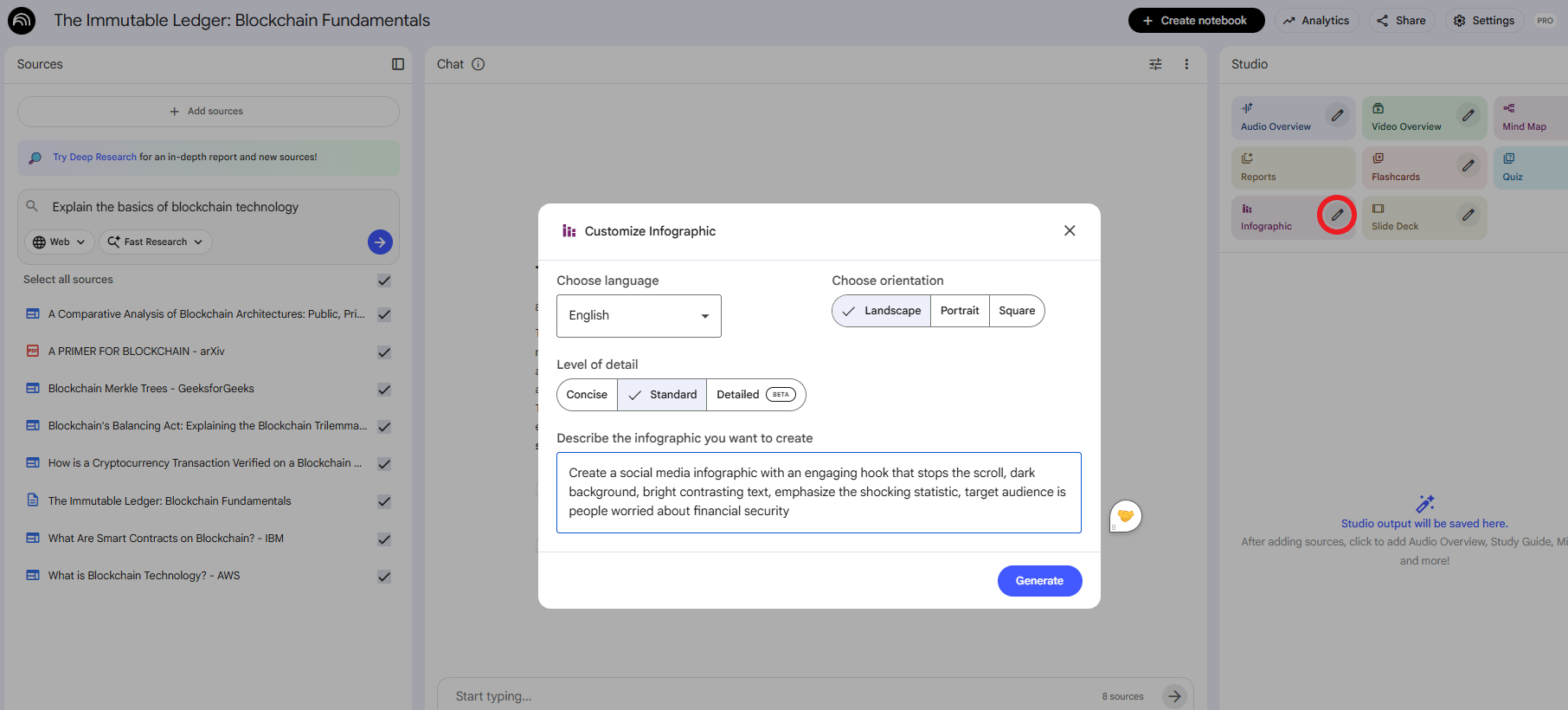
To get the best results from NotebookLM, you need to speak the language of design. Don't just ask for "an image." Ask for a specific structure.
Here’s the master list of 15 infographic types I use. Most people never even think to ask for half of these:
Infographic Type | Core / Advanced Formats | Best For |
|---|---|---|
1. Process-Based | Core: Step-by-step flows, workflows, roadmaps, funnels, loops. Advanced: Circular systems, decision trees, logic flows, journey maps, sprint cycles. | SOPs, onboarding, tutorials, system explanations. |
2. Data & Statistical | Core: Pie charts, bar/line graphs, dashboards. Advanced: Heatmaps, links, forecasts, survey visuals, hybrid data charts. | Reports, case studies, performance analytics. |
3. Informational | Core: Concept breakdowns, guides, overviews. Advanced: Pillar models, frameworks, cheat sheets, FAQ clusters, concept maps. | SEO content, courses, expert positioning. |
4. Timeline | Core: Chronological timelines, milestone maps. Advanced: Future forecasts, rollout plans, brand history, horizon charts. | Storytelling, product development roadmaps. |
5. Geographic | Core/Advanced: Regional maps, demographics, heatmaps, travel routes, sales territories, resource distribution. | Market analysis, travel guides, demographic insights. |
6. Comparison | Core: Side-by-side, pros/cons, before/after, tier charts. Advanced: “This vs That” grids, cost-benefit diagrams, myth vs fact, value comparisons. | Product features, customer decision support. |
7. Hierarchical | Core: Pyramids, ladders, org charts, stacks. Advanced: Value ladders, skill tiers, complex structures. | Business frameworks, revenue models, org structure. |
8. List-Style | Core: Tips, checklists, ranked lists, principles. Advanced: Best practices, mistake lists, do/don’t grids, resource libraries. | Content marketing, SEO, social media carousels. |
9. Resume + Personal Brand | Core: Skill charts, snapshot resumes, timelines, strength bars. Advanced: Personal brand maps, value prop visuals. | LinkedIn, portfolios, creator branding. |
10. Storytelling | Core: Problem → Solution, case journeys, success pathways. Advanced: Brand hero’s journey, story arc diagrams. | Persuasion, brand stories, sales decks. |
11. Structural & Spatial | Core: Matrices, quadrants, Venn diagrams, grids, cluster maps. Advanced: Spectrums, scales, feature maps, sweet-spot finders. | Strategy, positioning, psychology concepts. |
12. Scientific & Technical | Core: Anatomy diagrams, system maps, sequences. Advanced: Technical breakdowns, mechanics, how-it-works visuals. | Engineering, tech, science education. |
13. Interactive-Style (Static but Click-Like) | Core/Advanced: Click grids, hotspots, modular tiles, app-like layouts. | Mobile-friendly designs, engagement-driven content. |
14. Business & Marketing | Core/Advanced: SWOTs, value maps, canvases, offer stacks, KPI dashboards, customer personas. | Consulting, funnels, client presentations. |
15. Hybrid (Mixed Formats) | Examples: Timeline + Stats, List + Process, Comparison + Stats, Story + Data. | High-impact, multi-layered content that stands out. |
Step 3: Batch Production and Variation Testing
NotebookLM generates different results each time you run the same prompt. This enables rapid testing.
Generate 5-10 variations of the same content.
Select the top 2-3 that match your aesthetic.
Post these across platforms to see which performs best.
Iterate: Take the winning characteristics and use them in future prompts.
Step 4: Multi-Platform Distribution
Create one infographic in NotebookLM, then export it in multiple formats:
Instagram/TikTok: Portrait (9:16), bold headline.
LinkedIn: Landscape, professional design.
Blog: Embed an infographic to drive SEO value.
Creating quality AI content takes serious research time ☕️ Your coffee fund helps me read whitepapers, test new tools and interview experts so you get the real story. Skip the fluff - get insights that help you understand what's actually happening in AI. Support quality over quantity here!
V. How Do You Handle NotebookLM’s Daily Limits?
You’re currently limited to around ten infographics per day per Google account. The solution is choosing the best topics or using different accounts. Most creators don’t need more than ten high-quality pieces daily.
Key takeaways
Daily cap sits at ~10 infographics per account.
Create multiple accounts for different brands or niches.
Prioritize your highest-leverage topics.
Volume matters less than consistent, targeted output.
Infographic quantity isn’t the problem; topic selection and distribution are.
NotebookLM implements daily usage caps: approximately 10 infographics per day per account.
The Constraint: For a media business, 10 assets might not feel like enough.
The Solution: Create separate Google accounts for different niches or simply identify your 10 high-value topics for the day. A successful media business doesn't need 30 infographics daily; it needs 10 strategic ones.
VI. Conclusion to Part 1
You now have the engine. You know how to create professional-grade visuals in seconds without hiring a designer. You have solved the production problem.
But creating content is only half the battle. A factory filled with inventory doesn't make money until you have a distribution strategy. To turn this into a business, you need to know how to monetize it.
In Part 2, I will break down the 4 Revenue Models, the traffic strategies and the brutal economics of volume that determine whether you make $0 or $10,000 a month.
If you are interested in other topics and how AI is transforming different aspects of our lives or even in making money using AI with more detailed, step-by-step guidance, you can find our other articles here:
This Free AI Coder Feels Like Having a Dev Team in Your Browser!*
The "AI Dream" Is Finally Here (Build A RAG Agent In 5 Mins)*
*indicates a premium content, if any
🔥 How would you rate this AI Fire 101 article? |
Reply