- AI Fire
- Posts
- 💎 How to Design High-Converting Landing Pages to Win the 3-Second Attention (Part 1)
💎 How to Design High-Converting Landing Pages to Win the 3-Second Attention (Part 1)
Most websites fail in seconds. I show you how to fix your layout so people actually stay and pay. Simple steps for beginners with zero tech skills.
Neil Phan
January 10, 2026

TL;DR
Effective Landing Page Design requires balancing trust and selling power, avoiding the common traps of making a site that is either ugly or purely decorative. This guide introduces the DDD system (Design, Data, Deploy) to help you build high-converting pages by leveraging AI tools like Gemini for coding and Claude for copywriting. By following a structured 4-part layout and optimizing for mobile users, you can create a "Unicorn" website that looks professional and drives actual sales.
Key points
Strategy: Combine the utility of a "Tractor" site with the aesthetics of a "Ferrari" site.
Tool: Use Gemini to write HTML/CSS code and Claude to generate emotional sales copy.
Insight: 80% of users are on mobile, so vertical layouts and large buttons are non-negotiable.
Critical insight
A pretty website without good words is like a luxury car with no engine; it looks expensive but goes nowhere.
Is your website losing you money right now? 💸 |
Table of Contents
Have you ever spent a lot of time making a beautiful website, but no one bought anything? I understand that feeling because I was the same. When we start learning Landing Page Design, we usually make two big mistakes. First, we make a website that looks very old. It works, but people do not trust it. Second, we make a website that looks amazing, but it has no good words to convince people to buy. It is like a luxury car with no engine inside.
In this article, I will show you how I design a selling page using a simple system called DDD (Design - Data - Deploy). We will learn how to make a website that looks good and makes money using AI tools. This is Part 1, and we will focus on how to design the look and how to write "magic" words to sell. Let’s start together!
But wait, before we jump into the technical steps, remember that a great website is lonely without visitors. To solve this, you can look at how I use an AI system to create 30 days of content in just 30 minutes to drive massive traffic to my pages without burning out. This ensures that once your design is ready, you already have a crowd waiting to see it.
Part I. Why Is Landing Page Design The Key To Making Money Online?
A successful landing page must combine trust with selling power to convert visitors into buyers within the first 3 seconds. Many designers focus only on aesthetics ("Ferrari" sites) or only on utility ("Tractor" sites), but a high-converting "Unicorn" page balances both. Without understanding the customer's psychology and presenting an immediate solution, even the most beautiful design will fail to generate sales.
Key takeaways
Goal: Make the user think "This is exactly what I need" in under 3 seconds.
Model: Aim for a "Unicorn" site that is both beautiful (Ferrari) and functional (Tractor).
Fact: Design is just the cover; the selling logic is the engine.
Mistake: Hiring expensive designers often leads to pretty sites that don't sell.
Before we start building, you need to understand what a good website is. A great website must have two things: trust and selling power. If you miss one, you will waste your time.
1. The Difference Between A "Pretty" Site And A "Selling" Site
Many people think that if they hire a good designer, they will sell a lot. But that is not true. Design is just the cover. A smart Landing Page Design must understand the customer's mind. You need to make them think: "Oh, this is exactly what I need!" in just 3 seconds after they click your link.
2. The "Unicorn" Model In Web Design

I like to call the perfect website a "Unicorn" because it is very rare. To build one, you need to understand the two extremes:
The Tractor Site: This site is all about utility. It might have great information, but it uses messy fonts and bad colors. People leave because they think, "This looks like a scam."
The Ferrari Site: This site looks expensive. It has smooth animations and cool graphics. But it doesn't tell the user what to do. People leave because they are confused.
Your goal with Landing Page Design is to combine them. You want the beauty of the Ferrari to build trust, and the power of the Tractor to get the sale.
Real Example: The "Pretty" Trap vs. The "Unicorn" Success
To help you understand, let’s compare two imaginary websites selling the same thing: Organic Soap.
Website A: The "Pretty" Site (The Ferrari)

What it looks like: It has a video background of a waterfall. Bubbles float across the screen. The menu is hidden inside a tiny artistic icon. There is no text, just "Experience Purity."
The Result: It looks like an art museum.
The Traffic Problem: Visitors come, but they get confused. They can't find the "Buy" button in 3 seconds. They get frustrated and leave immediately.
The Numbers: 1,000 visitors ➔ 990 leave instantly ➔ 0 sales.
Why traffic drops: Because everyone leaves so fast (high "Bounce Rate"), Google thinks the website is bad. Google stops showing it to people. Traffic goes down.
Website B: The "Unicorn" Site
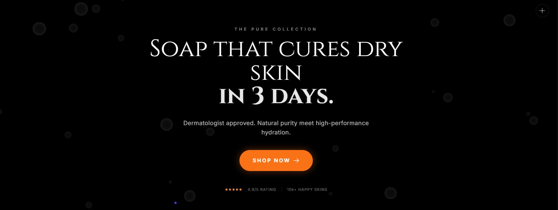
What it looks like: It uses the same beautiful colors as Site A, so it looks trustworthy. But, right in the center, it has a clear headline: "Soap that cures dry skin in 3 days." It has a big, orange "Shop Now" button that you cannot miss.
The Result: It looks like a professional store.
The Success: Visitors see the beauty (Trust) and read the headline (Action). They stay to read more.
The Numbers: 1,000 visitors ➔ 600 stay to read ➔ 50 sales.
Why traffic grows: Because people stay longer to read, Google thinks, "This site is helpful!" and sends more free traffic to it.
Part II. How To Start Your Landing Page Design With A Global Standard?
Follow the DDD system - Design, Data, Deploy to ensure every critical aspect of your landing page is covered. Start with the Design stage to establish a professional look that builds trust, then move to the Data stage to craft persuasive content based on customer research. Finally, the Deploy stage handles the technical setup like domains and SEO, ensuring your perfect page actually reaches an audience.
Key takeaways
Step 1: Design focuses on colors, layout, and building visual trust.
Step 2: Data is the "soul," using AI to write words that solve specific pain points.
Step 3: Deploy involves the technical launch, hosting, and SEO optimization.
Rule: Never skip a step; a site without data is empty, and a site without design is untrustworthy.
To make it easy, I always divide the work into 3 small steps. Each step is important, so do not skip any.

1. The Design Stage (Look And Feel)
This is where we decide how the website looks. The goal is to build trust immediately.
The Goal: I wanted a site that feels friendly but professional- a true "Unicorn."
The Colors:
Background: I chose a soft cream/off-white color. Why? Because pure white hurts the eyes when reading long articles. Cream feels warm and inviting.
Action Color: I used a bright orange-red for the Logo and the "Subscribe" buttons. Why? Orange represents "Fire" (energy) and makes the button impossible to miss.
The Layout: It is centered and clean. No flying animations, no distractions. Just clear focus.
2. The Data Stage (Content And Research)
This is the "soul" of your website. Design catches the eye, but Data captures the heart.
The Research: Who is the "Data"? It is YOU.
The Insight: My data showed that my readers (professionals from companies like Google, Meta, and Tesla) are tired of "AI Hype." You don't want just news; you want to actually use AI.
The Solution: That is why the first sentence on my site is: "Master AI with practical guides".
The Lesson: I didn't write about myself. I wrote about what you need. That is the power of Data.
3. The Deploy Stage (Technical Part)
We will talk about this in Part 2. This covers how to put your Landing Page Design on the real internet, how to buy a domain name, and how to help people find you on Google (SEO).
Learn How to Make AI Work For You!
Transform your AI skills with the AI Fire Academy Premium Plan - FREE for 14 days! Gain instant access to 500+ AI workflows, advanced tutorials, exclusive case studies and unbeatable discounts. No risks, cancel anytime.
Part III. What Structure Do You Need For An Effective Landing Page Design?
Every effective landing page relies on four structural "bones" to guide the user logically toward a purchase. Start with a Hero Section that states the main benefit clearly, followed by Value Propositions that break down specific advantages. Add Social Proof like reviews or logos to build trust, and finish with a simple Closing and Form to capture the lead or sale immediately.
Setting up these four structural bones requires focus, but you don’t have to do it the hard way. To speed things up, I often combine these layouts with specific ChatGPT hacks to boost productivity, allowing me to finish an entire page’s copy in a single afternoon rather than a whole week.
Key takeaways
Structure: Hero Section -> Value Props -> Social Proof -> Closing Form.
Hero: Must contain a headline with the biggest benefit and a clear button.
Trust: You cannot sell without social proof (reviews, partner logos).
Tactic: Keep the final sign-up form simple to reduce friction.
You do not need to be creative with the structure. In fact, being too creative can hurt you. People expect websites to work a certain way.
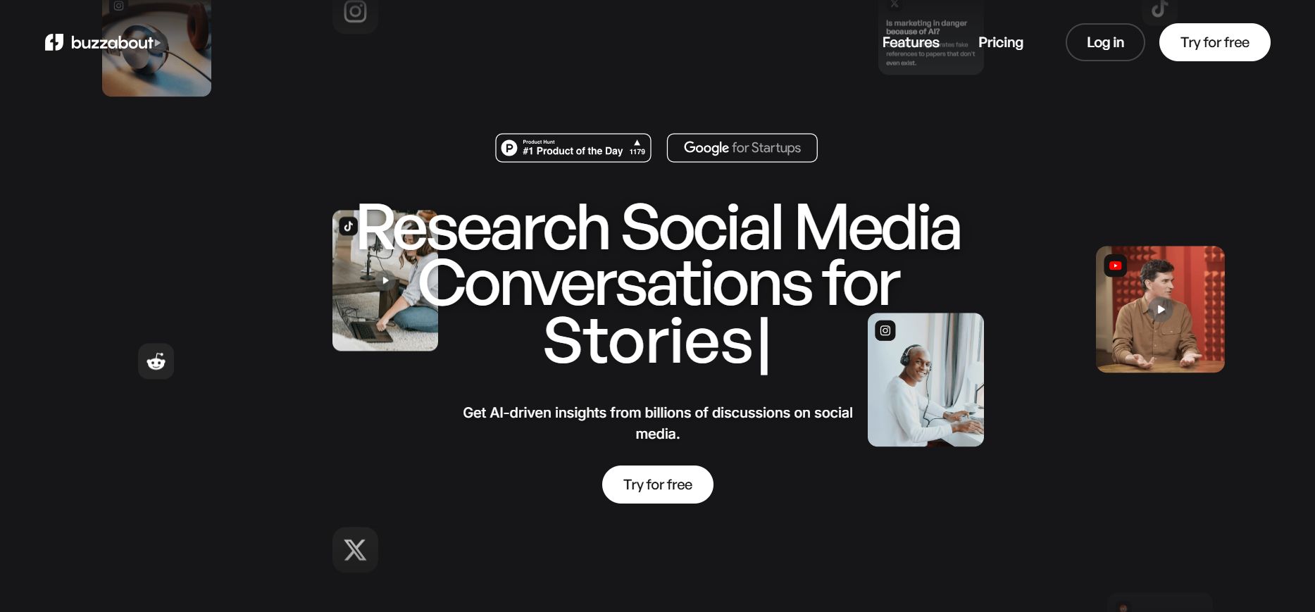
Every effective page relies on four "structural bones." If you miss one, the skeleton falls apart. Let's analyze how I built the AI Fire homepage to see these bones in action.
1. Hero Section (The Top Part)
This is the top part of the screen. It is the most critical 3 seconds of your user's life. It must answer: "What is this?" and "What do I get?"
The Theory: You need a clear Headline (The Promise) and a Sub-headline (The Explanation).
Real Example (AI Fire):
Headline: I didn't write "Welcome to my blog." That is boring. I wrote: "Master AI with practical guides". This promises a clear result: Mastery.
Sub-headline: "Your daily hub for AI-powered productivity." This explains how we do it (daily) and what it improves (productivity).
Why it works: It focuses entirely on the user's benefit, not on me.
2. Value Propositions (Why Choose You?)
Why should they choose you instead of the 1,000 other options? This is where you explain the "Special Sauce."
The Theory: Don't list features. List solutions to specific problems.
Real Example (AI Fire):
The Problem: Most people find AI "too hype," "too confusing," or "useless news."
The AI Fire Solution: Look at the text: "Practical guides" and "no-fluff" (implied by the clean design).
The Layout: On the live site, this is often presented as: "No Hype," "Just Workflows," "Save Time." This tells the user: "We are different because we are useful, not just loud."
3. Social Proof (Trust)
You can say you are the best, but people won't believe you. They believe numbers and authority. This is the most powerful psychological trigger.
The Theory: Use specific numbers, logos, or testimonials to prove you are safe.
Real Example (AI Fire):
The Number: I display this prominently: "Join 75,000+ professionals". A big number proves I am popular.
The Authority: I mention where they work: "from Google, Meta, Microsoft, Tesla".
Why it works: If engineers from Google trust this site, you (the visitor) feel safe trusting it too. This kills 99% of doubt instantly.
4. Closing And Form
This is the moment of truth. You want their email or their money. The rule here is: Reduce Friction.
The Theory: Ask for as little as possible. Every extra box you ask them to fill out reduces your conversion rate by 50%.
Real Example (AI Fire):
The Form: Look at the input box. I do not ask for "First Name," "Last Name," or "Phone Number." I only ask for "Enter your email."
The Button: It is Bright Red/Orange ("Subscribe For Free"). It stands out against the cream background.
Why it works: It is so easy to subscribe that the user doesn't even have to think. One click, and they are in.
Part IV. How To Find Inspiration For Landing Page Design Without Being An Expert?
If you just look at a blank screen, you will have no ideas. My secret is to look at the best people in the world.
1. Great Websites For Ideas
Spend 30 minutes looking at these sites:
awwwards.com: See the best designs in the world.
dribbble.com: See modern and trendy styles.
canva.com: A very easy tool to try colors and fonts.

This table helps you know exactly which site to visit for specific lessons, avoiding the mistake of copying the wrong style (e.g., copying an art site to sell a product).
Inspiration Source | Category | Identifying Characteristics | Traffic & Sales Reality | What You Should Learn |
Ferrari (The Supercar) | • Very artistic, strange effects. • Menus are often hidden. • Little text, lots of abstract imagery. | • High traffic from curiosity/designers. • Low Conversion Rate (Hard to use). | Only learn about Color Combinations and Creative Inspiration. Do not copy their sales structure. | |
UI Trends (The Trends) | • Focuses on small details (Buttons, Search bars). • Colors are very modern and catchy. | • N/A (These are design showcases, not real functional sites). | Learn how to design Buttons, Shadows, and Corner Radius to look modern. | |
Top Tech Sites (Stripe, Airbnb, Notion) | Unicorn (The Money Maker) | • Extremely clear structure. • "Buy" buttons are always the most visible element. • Super fast loading speed. | • Huge Organic Traffic. • Extremely High Sales Conversion. | Copy this structure 100%. This is the template for making money. |
2: The "Secret Formula" of Unicorn Websites (Design Rules)
Element | The "Amateur" Mistake (Tractor) | The "Unicorn" Standard | Why Does This Rule Work? |
Fonts | Using 4-5 different fonts (mixing serif and sans-serif randomly). Looks messy. | Maximum 2 Fonts: • 1 Bold Font for Headlines. • 1 Clean Font for Body Text. | It stops the user's brain from getting tired. Consistency creates a feeling of trust and luxury. |
Colors | Random color mixing, using colors that are too bright or "fighting" for attention. | The 60-30-10 Rule: • 60%: Neutral Background (White/Cream) • 30%: Brand Color (Blue/Black). • 10%: Action Color (Orange/Red - Buttons). | The user's eye is naturally drawn only to the 10% (The Buy Button). This drives high click-through rates. |
White Space | Trying to cram text and images into every empty spot. Fear of wasted space. | "Breathing Room": Leaving large empty spaces between sections and paragraphs. | White space is not waste; it is luxury. It forces the customer to focus entirely on your key message. |
3. How To Make A Moodboard
When you see a beautiful button, take a photo. If you see a site with nice blue and white colors, save it. Put them all in one folder. This helps you stay on track during your Landing Page Design process.
Part V. How To Use AI To Do Landing Page Design 10 Times Faster?
Now is the fun part! We will not write code by hand. I will show you how to ask AI to do it. I use Gemini.
1. How To Write A "Prompt" For AI To Design For You
To make AI do it right, you must describe everything. Don't just say "Make me a website."
Example of a prompt I used successfully:
"I want you to be a web designer. Write HTML and CSS code for a landing page for 'Pet Care at Home' service. It should have: 1 top part with the title 'Your pet deserves love', 3 columns talking about: Bathing, Walking, and Health Check. Use light yellow and wood brown colors to make it feel warm. The 'Book Now' button must be bright orange and have rounded corners."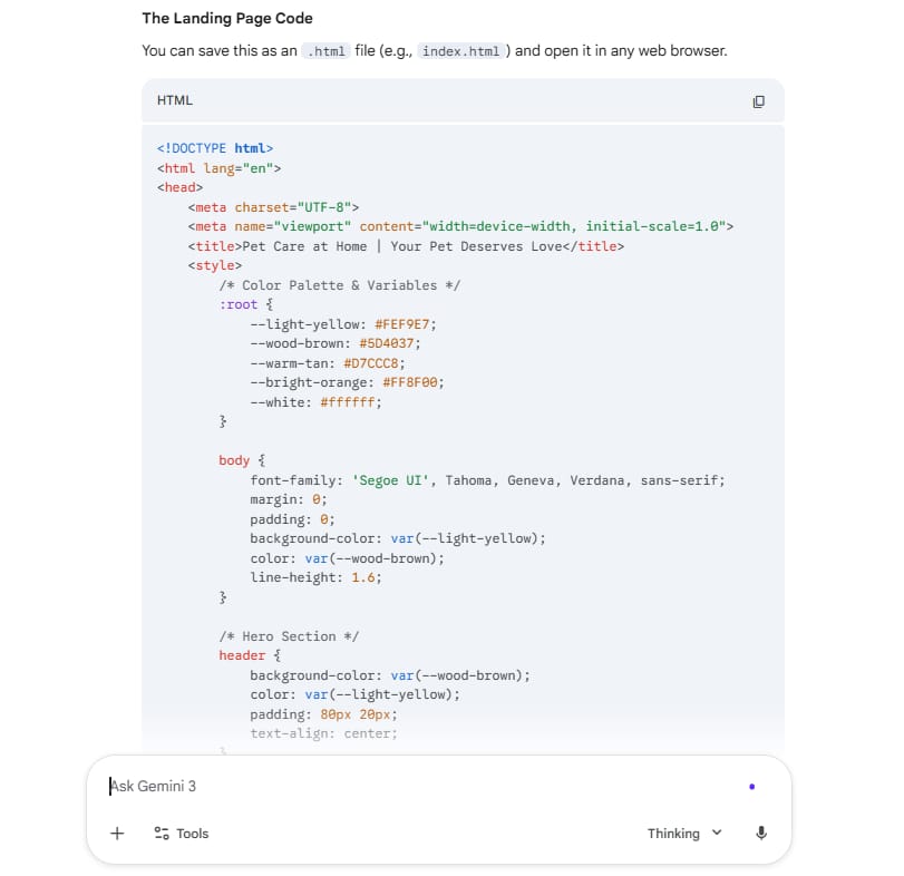
2. How To Make The Design Look Better
The first code from AI might be a bit simple. You can ask it to change:
"Please make the space between sections wider so it is easier to read."
"Add an effect: when I move my mouse over the button, it gets a bit bigger."
"Change the font to Montserrat to make it look modern."
Just talk to the AI like it is your helper. After 5-7 times, you will have a great design.
Part VI. Why Is Content (Data) More Important Than Pictures In Landing Page Design?
Remember the luxury car with no engine. If your site is pretty but the words are boring, people will leave. We need to find "data" from real customers.
1. Find Customer "Pains" On The Internet
I use a tool called buzzabout.ai to see what people are talking about. You can also go to Facebook groups or Reddit.
Example: If you sell air purifiers, and people say "The machine is too loud, my baby cannot sleep." That is a "gold" idea for your website.
Feature | 1. Buzzabout.ai | 2. Reddit | 3. Facebook Groups |
The Role | The Radar (Speed) It acts like a giant vacuum, collecting questions from all over the internet to give you a "Big Picture" view. | The Truth Teller (Brutal) Because it is anonymous, people are 100% honest here. This is where you find the ugly truth about products. | The Psychologist (Emotion) People use their real names here, so they share feelings, fears, and ask for sympathy. |
How To Use It | Input Broad Keywords. Simply type your product name (e.g., "Air Purifier"). It will visualize the most asked questions on a map. | Search Negative Keywords. Go to communities like r/Parenting. Search for: "Air purifier hate," "regret buying," or "waste of money." | Search "Life Problems." Join groups like "New Moms." Do not search for machines; search for symptoms like "baby coughing" or "dust allergy." |
The "Gold" You Find | Trends & Topics. You won't see deep emotions, but you will see what is popular. It helps you decide which direction to research first. | Specific Complaints. You find detailed technical failures. You learn exactly why they returned a product (e.g., bright lights, weird noises). | Emotional Language. You find the "heart" words. You see how they describe their pain and how they feel when a problem is solved. |
Real Example (Selling Air Purifiers) | You see the word "Smell" is the biggest bubble on the screen. → Insight: The market is worried about bad odors, not just dust. | You read a comment: "The LED light is so bright it wakes my baby up at 2 AM. It sounds like a tractor." → Insight: You must sell "Sleep Mode" and "Dark Mode." | A mom writes: "My heart breaks every time I hear my son wheeze at night. I just want him to sleep." → Insight: Use these exact emotional words in your headline. |
2. Write Selling Words With Claude AI
You can use Claude.ai to turn those ideas into emotional words. Try using "Deep Think" mode so Claude can understand people better.
Example prompt for selling content:
"I am selling air purifiers for families with babies. Their biggest fear is dust making the baby cough and the machine being too loud. Write 3 short paragraphs for my Landing Page Design. Paragraph 1: Focus on the fear of dirty air. Paragraph 2: Introduce the super quiet machine. Paragraph 3: Promise a good sleep for the baby. Use friendly and simple language."
After receiving the result from Claude, do not simply paste the entire block of text everywhere. Instead, adapt it to fit the specific needs of each channel.
For your Website, apply the "chop shop" tactic: use the third paragraph (the result) as your Main Headline to grab attention immediately, place the first paragraph (the pain) right below it in italics to evoke empathy, and convert the second paragraph (the solution) into concise, scannable bullet points for your features section.
Conversely, for Social Media, you should keep the storytelling structure intact to drive emotion. You can post the full text in the "Pain - Solution - Pleasure" sequence for Facebook ads, or use it as a visual script for TikTok: start with a crying baby, cut to the silent machine, and end with a happy mom smiling. With just one AI result, you have enough material for a complete multi-channel campaign.
3. The "Maui" Rule - Sell The Result, Not The Features
People don't buy a "machine with 3 layers of HEPA filter" (this is a feature). They buy "feeling safe because their baby breathes clean air" (this is the result).
In marketing, we say "Sell the Maui vacation, not the flight." The flight is boring, but the beautiful island is what everyone wants.
Part VII. How To Optimize Landing Page Design For Mobile Phones?
Did you know that 80% of people see your site on their phone? If you forget the phone, you lose money.
1. Use The "Vertical" Style
On a computer, we arrange content horizontally, but on a phone, trying to shrink three columns to fit side-by-side is a disaster because the text becomes unreadable. The mandatory solution is to switch to a Single Column layout, where every element stacks vertically from top to bottom. When working with AI, you must command it to design with a "Mobile-First" mindset, ensuring every section occupies 100% of the screen width so customers can easily absorb the information.
2. Make Buttons Big
Customers browse with one hand, and their thumb can only comfortably reach the bottom half of the screen, so placing important buttons at the very top is the fastest way to lose a sale. Mobile buttons must be large enough to avoid mistaps and placed within natural reach. The best approach is the "Sticky CTA" technique - creating a fixed purchasing bar glued to the bottom of the screen. This ensures the "Buy Now" button remains directly under the customer's thumb, no matter how far down they scroll.
3. Loading Speed Is Gold
Mobile users are extremely impatient; if a site takes more than 3 seconds to load, they will leave instantly. To keep your site light and fast, you must convert all images to the WebP format, which drastically reduces file size without losing sharpness. At the same time, require the AI to add "Lazy Loading" to the source code so that images only load when the customer actually scrolls to them, ensuring the initial content appears almost instantly.
Part VIII. FAQ - Common Questions About Landing Page Design

I don't know how to code. Can I do it? Yes! AI like Gemini or Claude will write the code for you. You just need to describe your idea.
What colors should I use? Blue is for trust (money, health). Orange and Red are for action (food, sales). Black and Gold are for luxury. Choose a color that matches the feeling you want to give.
How do I know if my site is good? Send the link to 3 friends. Ask them: "What does this site sell?" if they know the answer in 5 seconds, you are successful!
Summary Of What We Learned Today
Building a Landing Page Design is about organizing human psychology. We learned:
The "Unicorn" mindset: Beautiful and effective.
How to get ideas from top websites.
How to use AI (Gemini) to make code without being a coder.
How to research customers and use Claude to write emotional words.
I hope you feel more confident now. In Part 2, I will show you how to put the site online for free and how to help people find you on Google.
Next Step: Try to go to Gemini now and use the prompt I gave you in Part V. You will be surprised! See you in Part 2!
If you are interested in other topics and how AI is transforming different aspects of our lives or even in making money using AI with more detailed, step-by-step guidance, you can find our other articles here:
How well did this guide cover the topic of "making money with AI"? |
Reply